UXL Designathon
Most User-Centric Award


Duration: 48 hours
Tools: Figma, Survey Monkey, Adobe Illustrator
Role: UX/UI designer
Background
The UXL Designathon was a 48-hour case competition based on UX/product design to solve a problem. The Designathon took place online with 65+ teams participating in it. There were multiple category prizes such as, “Most User Centric." This award is given to the team that demonstrates the strongest focus on user needs through each stage of the design process.
Design Prompt
How might we intentionally explore what matters to us?

Our Solution
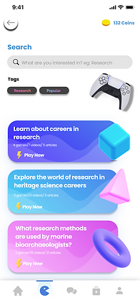
Play-full, an app designed for accessible & meaningful career support. Designed with the goal of learning and securing positions in your desired field.

Thought Process
After analyzing the design prompt, my team and I focused on narrowing down the overall problem. During our meetings, the main theme of our conversations centred on what matters to us right now. As university students, we desired to properly learn and enhance our career paths in search of internships. Afterwards, we concluded to focus on the age group between 16-24 as they were the most impacted by this problem.


The goal was to find a solution to this problem. Upon doing research, we found a growing trend in video games being used for educational purposes. So, the solution to this problem involved the gamification of information that would allow users to be engaged as well as have fun. Taking inspiration from QuizUp, UXcell, and Tomodachis we started implementing certain features that would enhance the whole experience.
Research
Our design process was aided by collecting research on the severity and impact of the problem on our target age group. Some interesting findings:
-
Youth unemployment was down -33.0% among ages aged 15 to 24 during the beginning of the pandemic
-
21% of millennials said they have changed jobs within the past year
-
1 in 4 University Graduates are Thinking of Their Careers
User Interviews & Testings
After reviewing external research, my team conducted surveys and interviews through Survey Monkey and Zoom meetings to get first-hand knowledge of our specific user communities. Our findings included:
-
In depth one-on-one 30 minute interviews (of 7 questions each)
-
30+ survey responses (9 questions)
-
A/B Testing in person with feedback
-
Usability testing in person


Based on our results, my team found that many participants were, "anxious and nervous to start learning about new career options." However, the participants were motivated to learn when they perceived it as a game. This was one of the main reasons we decided to go for a gamification route for education.
-Interview Research Participant
User Persona

Low-Fidelity
After gathering our research we began laying out our outline for how the app should be structured. These are some of the low-fidelity layouts we came up with:


High-Fidelity Mockup
When our layouts were all finalized we started to work on the real mockup. We decided to go with a simple blue as the primary colour with the font being Poppins. Additionally, we decided to use many smooth icons to help make the app look more lively and fun. Here is our final mockup:


Key Takeaways


Results
After 48 hours of all-nighters and junk food, we finally submitted our mockup. We were awarded the, "Most User-Centric” title because of our focus on understanding our users.
