McMaster Designathon 2021
1st place winners


Duration: 48 hours
Tools: Adobe XD, Adobe Photoshop, Miro
Role: UX/UI designer
Background
The Mcmaster Design League’s 2nd annual designathon is a 48 hour competition where 40+ teams from 5+ countries participated. The competition was a traditional UX/UI competition with competitors ranging from different professions like engineering, business, and arts. It was also sponsored by companies such as Meta, Deloitte, CIBC, and more.
Design Prompt
Design a brand new mobile-first website for Martindale Animal Hospital. Ask questions and determine real world client needs. Afterwards, create a modern design that fulfills the needs, feels natural, and has a unique identity.
Our Solution
-
Create a welcoming brand image and keep it consistent through the whole website
-
Use multiple photos of both the workers and animals throughout the website
-
Make an easy to use interface with thoughtfully placed features and call to actions
Thought Process
When looking over the design prompt we initially thought this was going to be straightforward. However when inspecting further, we found that we needed to only create the mobile website, but to also create it in a meaningful way. When brainstorming we tried to see it through the user’s point of view and what would be useful for them to have access to.


User Needs
While starting our project we decided to split the design process into 2 categories. We wanted to base our design off of user needs and business goals. We were able to gain more insight into the business goals through scheduling a session with one of the judges who helped clarify.

Now that we understood the needs of both user and stakeholder we carefully thought out the features to be included in the mobile website. When we figured that out we laid it out and created an information architecture to keep us organized.
Information architecture

Journey map
One of the business goals was a store feature where users can order products for their animals. When working on it we created a user journey map to map out how the user would feel going through our initial design for our shop.
Feedback
After wireframing, we shared our work with a design mentor and professional UX designer who gave us some feedback. From this feedback period, the team discovered certain things as below.

-
Pages are not clear. We should clearly separate Home, About Us, Contact Us, Tips, Blog post, Vet Store page.
-
CTA buttons were missing. We should add different CTA buttons in different pages, for example, the CTA button in the contact page which is important for users to reach out to MAH.
-
User control and freedom were lacking, for example, adding the search bar of the vet store main page in order to give users control to search what they desire for.
-
Complete shopping process was not finished in this wireframe stage.
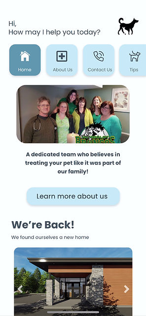
High fidelity
After taking the feedback into consideration, we worked all night on creating the final mockup design for the mobile website. In the design we decided to create a scrolling menu bar at the top instead of the usual hamburger button. We went with this design as when doing A/B testing, this design allowed for quicker navigation time. We also put multiple pictures within the mobile website to highlight MAH’s caring and intimate community.


key Takeaways


Results
After a grueling 48 hours our team submitted our final mockup, where we eventually made it to the finals. In the end we won 1st place in this designathon with the actual owners of MAH choosing our design for future mobile website considerations.

Prototype